Okay, so, that’s happening.
“* Knights” shows an utter lack of creativity and a boneheaded insistence from the West Point-fetishist owner that doesn’t bode well for a successful team. That said, given the three qualifiers he was allowed to pick from, I think they probably went with the best one.
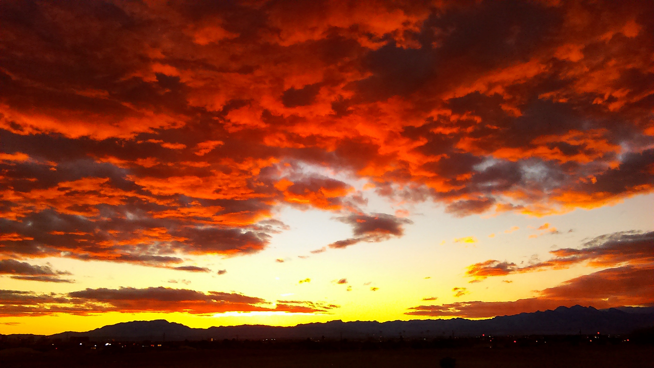
“Golden nights” is a pretty apt descriptor of sunsets in Las Vegas. “Desert nights” is technically true, but when we get away from the intendre, what the hell is a “Desert Knight?” “Silver” doesn’t work for either; most people outside of Nevada don’t care about the “Silver State” nickname, and otherwise it’s either irrelevant or redundant (aren’t knights usually silver?).
(”Golden Knights” is also the name of the Army acrobatic/competitive parachuting team, which gives Foley yet another out.)
The constraints given to the Adidas (née Reebok, née CCM) identity team must have been maddening. Who knows what better ideas they would have come up with, without what sounds like a nightmare (knight-mare?) of a client who admitted himself was breathing down their necks the whole time.
The colors they chose to work with are solid, and I think would be apt for virtually any identity rooted in Las Vegas. The color roughly termed as slate could morph into a navy or dark violet depending on the idea, but the gold and red (and obligatory black and white) are almost no-brainers. Look at that sunset again.
The logos exist on good foundational ideas but suffer from poor craftsmanship—not too surprising, as this was clearly a rush job. The primary incorporates what I assume were Foley’s tentpole requirements: a knight’s helmet, and a shield, because West Point. Given that, the negative-space V is superb, and the letterform itself just works. Others have noticed incongruences with the lighting work on this illustration.
The secondary, again given the nature of the whole thing, uses the Welcome sign starburst to great effect above some crossed swords. Both logos suffer from looking plain, even clipart-like, in flat and digital; but so far, the embroidered examples work really well. Perhaps they’re worrying too much about the fabric or embroidery construction of logos coming out of Adidas, to the detriment of printed or digital applications, because these criticisms also applied to the new Winnipeg Jets package from a few years ago, and to a lesser extent the months-old Florida Panthers rebrand.
As a Greater Los Angeles-born hockey fan who grew up in Las Vegas, watching my Ducks from afar, and now bouncing around the country due to the area’s lack of tech jobs, I’m still happy that the legacy of the Thunder and Wranglers has culminated in an NHL team, and not just a relocation but a team built in our city from day one. But it’s gonna take more than a referential starburst to care about this identity—and that’s to say nothing of the abhorrent decision to lop off half of our city’s name, especially for the sake of aligning with the LVCMA and general tourism marketing. This has to be our team—Las Vegas—and though it’s probably too late now, I hope that when the inevitable refresh comes three to five seasons in, the article is restored.