IBM
- Design research
- Human interface design
- iOS front-end development
From January 2014 to April 2015, I was a designer and front-end developer at the first IBM Design studio in Austin, Texas. After an 11-week Designcamp, I served IBM's Enterprise Content Management division with Matthew Paul and Samantha Mak.
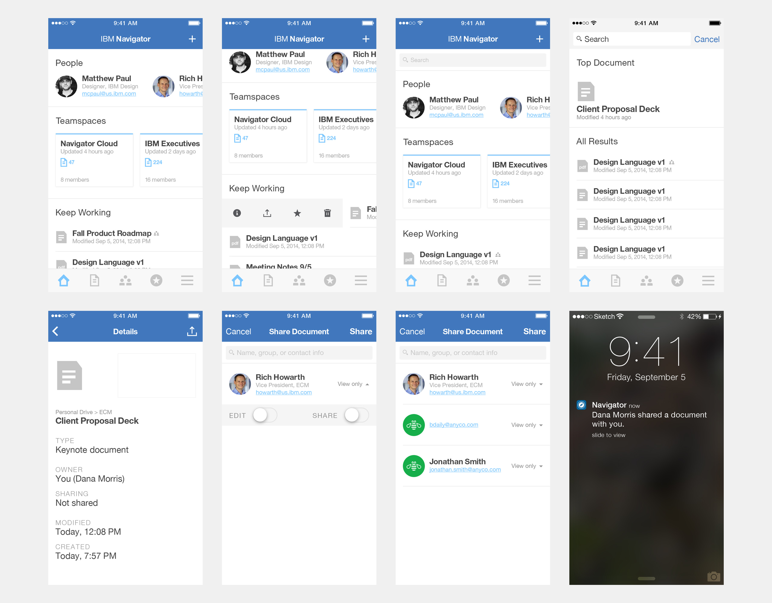
IBM Navigator Mobile is an enterprise sync-and-share app for iPhone, made to work with IBM Content Navigator repositories. Navigator Mobile was the first product released by the ECM division conceived through IBM Design Thinking.
Research
For our first six months on ECM, we conducted research to better understand the industry, the nuances of the product, and the desires and struggles of its users and vendors.
The three of us conducted interviews, synthesizing them into personas and scenarios that allowed us to understand both current and potential capabilities of ECM software. We carried those insights forward into wireframes and mockups for new products centered around the concept of “teamspaces” and using predictive services to facilitate collaboration.

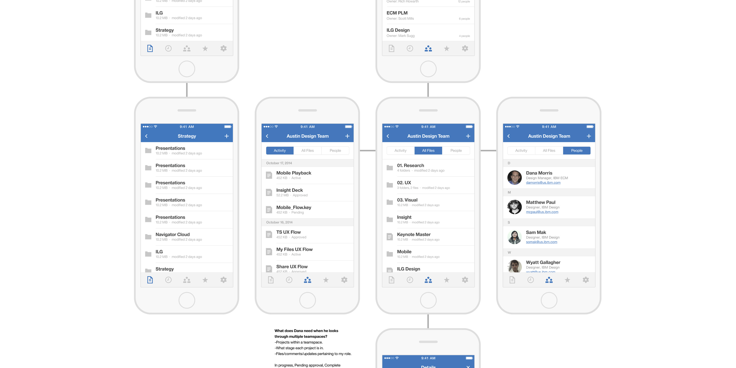
A flow map I put together going through viewing and editing a document in a teamspace.
A paper prototype of configuring a new teamspace, drawn up by Samantha.
Challenges
The Content Navigator platform is a stalwart of the ECM industry, having existed in some form for over two decades, but it was time to get serious about mobile. Upon direction from product management, we took a hard look at offerings from both consumer cloud storage services like Dropbox and business services like Box, for the high bar they set in user experience and customer engagement.
We had six months to move from concept to first shipment. It would be one of IBM's first apps built in Swift, which was only public for a few months at this point; for most of our developers, experienced in Java, this would be their first native iOS app. It had to contend with the mighty Content Navigator platform and its two decades of legacy code. And top IBM executives were very interested in this app's success.
Iteration
Our original design concepts circled around our prior research into “teamspaces.” We knew these would have to be pared down in time, both to focus on the core sync-and-share functionality and to remain feasible given the current state of the platform and the capabilities of our development team.
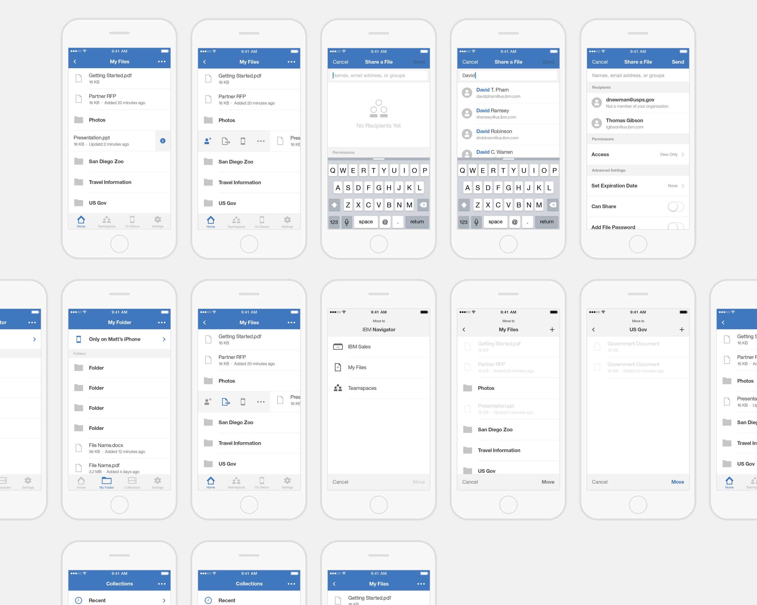
Over time, the goals and scope of the project were adjusted as we better understood the limitations of the existing platform, and the information architecture went through several revisions based on dogfooding and stakeholder feedback.


Result & postmortem
The first "gold master" was approved in March, right on time, and shipped shortly after the equinox. With this project moving to maintenance mode, I decided it was the right time to depart IBM Design to continue work on Boldened.
The most recent version as of this writing, 3.1.0, was released on April 8, 2017, and still retains the original design intentions. A few months after the app first shipped, IBM announced a partnership with cloud storage provider Box, prompting updates to Navigator Mobile that gave it better support with on-premise installations of IBM's ECM platform. Most of its thousands of users across hundreds of companies, including many Fortune 500s, receive the app through MDM deployments.

App Store screenshots for IBM Navigator Mobile v2.4.1.
As a pure designer through the first half of the project, I feel some regret in simplifying the visual treatment. We erred on the side of decreasing development time, but in relying on so many UIKit defaults we ended up with a very plain implementation of the IBM Design Language. The budding language's assets, particularly icons, were not yet optimized for the dimensions UIKit calls for, and I missed an opportunity to contribute to the language, an open studio project.
Toward the last few months, as one of two experienced iOS developers across the team I became more involved in implementation. It was my first exposure to agile processes and version control on a shipping corporate project, made more challenging by the steep learning curve of Rational Team Concert. I walked away with much more experience in working with other developers.