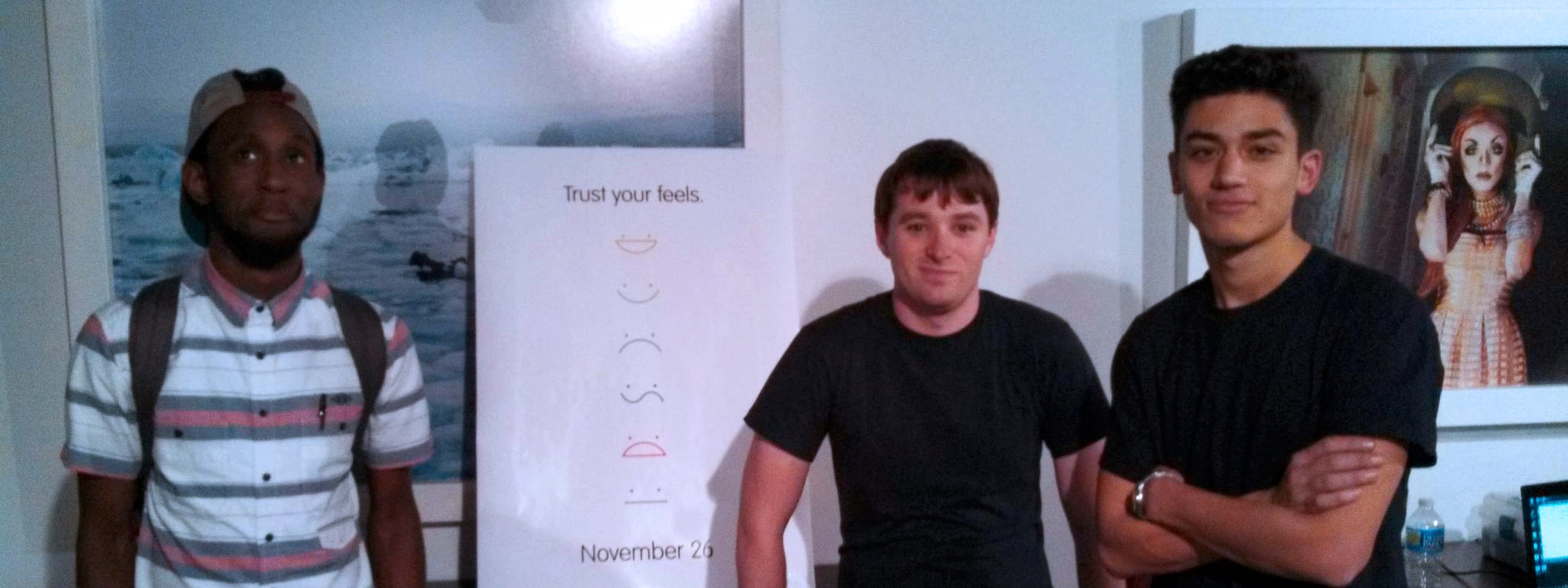
Ameer Carter (left), myself, and Joseph Albanese exhibiting our first release in November 2013.
Boldened (Feels)
- Design research
- Human interface design
- iOS development
In the fall of 2013, my last quarter at SCAD in Savannah, I brought Ameer Carter and Joseph Albanese together with me to build an app for iOS, as part of a custom course advised by professor Josephine Leong.
Boldened, originally Feels, was designed to help its users "make happier decisions." TechCrunch's Sarah Perez declared it "the pro/con list for the emoticon generation." Using emoticons for rating, rather than harder-to-understand numeric scores or percentages, Boldened made decisions with a lot of options or lots of data easier to understand.
Concept
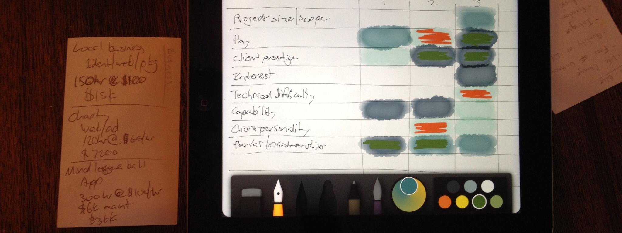
The initial concept for Boldened came as the three of us were deciding on what to build. We had several solid options whiteboarded out in a decision matrix, and we were looking for an interesting problem that had big potential. After a few hours of debate, I realized that we were probably staring at our app the whole time: an app for decisions. Putting that idea on the board was a mere formality. I think once I said it, we all knew that would be our direction.
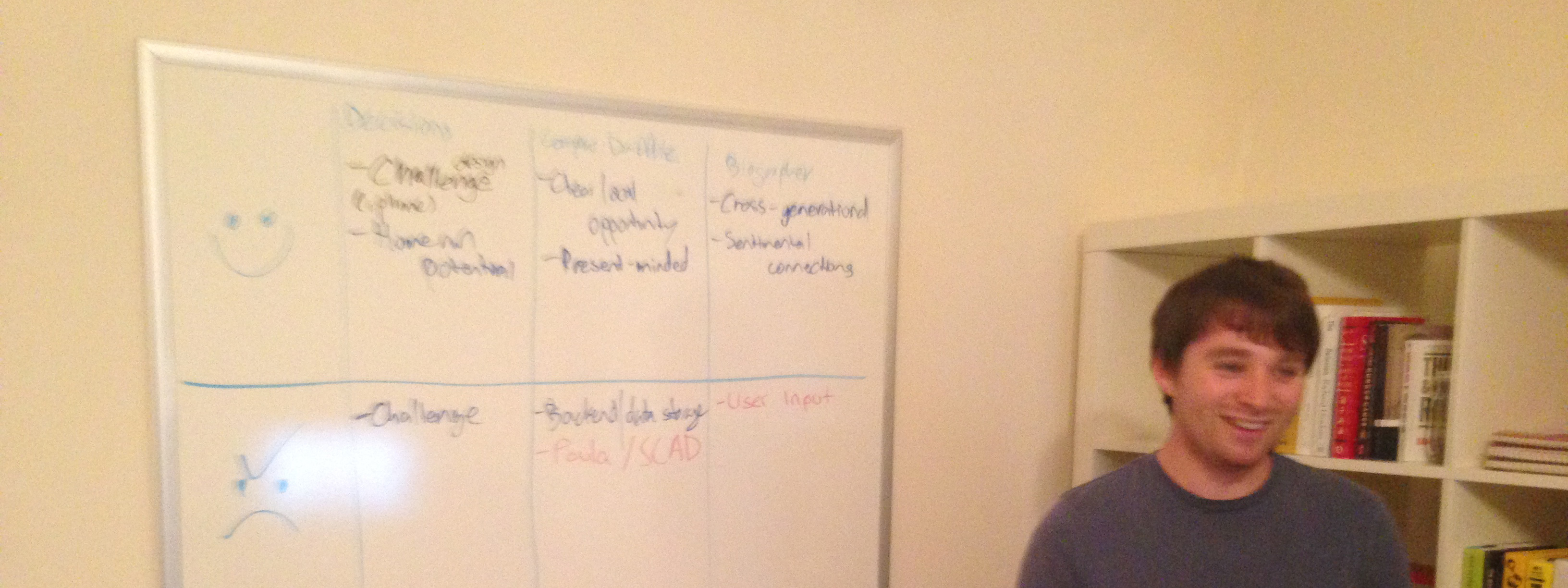
Me at the helm of Joseph's whiteboard, on which was basically our first prototype choosing itself.
Challenges
We agreed to a simple grading system with Professor Leong: If we successfully submitted the app to the App Store by the end of the last class session, we would all receive 100%. If we didn't, we would all fail.
This was a tall order, for after we chose this direction we only had nine weeks remaining, and one developer—me.
Research & prototyping
To move as quickly as possible, and because we figured that given decision-making is a universally relatable concept we could get away with it, we eschewed deep user research and leaned on ourselves and our own instincts. (Whether or not this is a popular way to work as a professional designer, it was a great learning experience for us.)
Our main goals in research were understanding the app's information architecture—how do we fit a two-dimensional grid on a phone display?—and how pairs of options and influences would be rated. Hours of discussions around whiteboards let us figure out that iOS's master-detail and table architectures fit our needs perfectly, and through freestyled personas and discussions around simulating their decisions through different rating methods, we understood how complicated they all were and resolved to do something different.
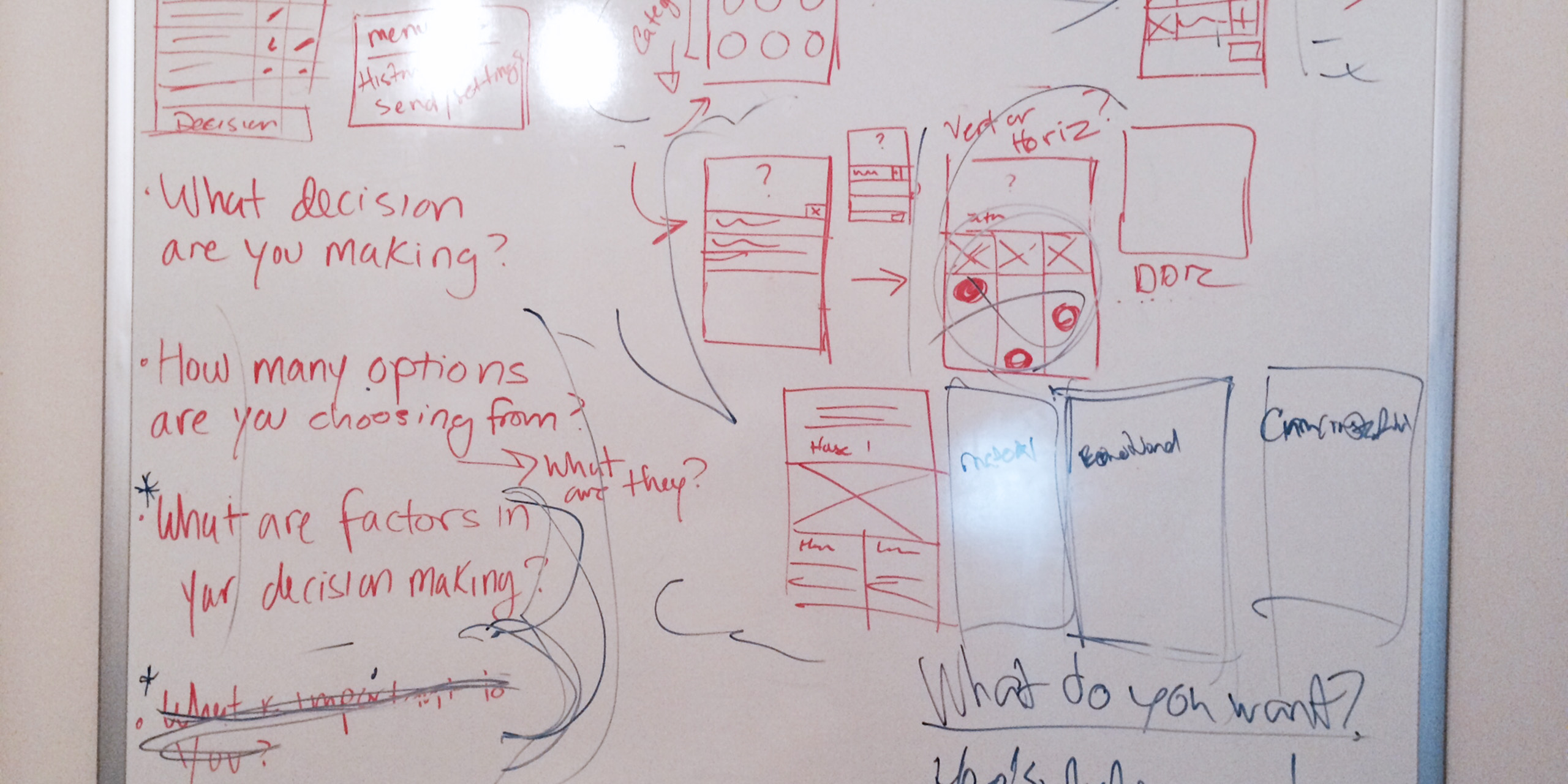
Now that we had a plan and the rough details down, we only had about a month left to build it and ship it. Most of our UI exploration happened on whiteboards, with most prototyping being done by me in live code. We were somewhat early adopters of Sketch, and used it to mock up more polished UI details before implementation, like the display of user-picked photos for choices.
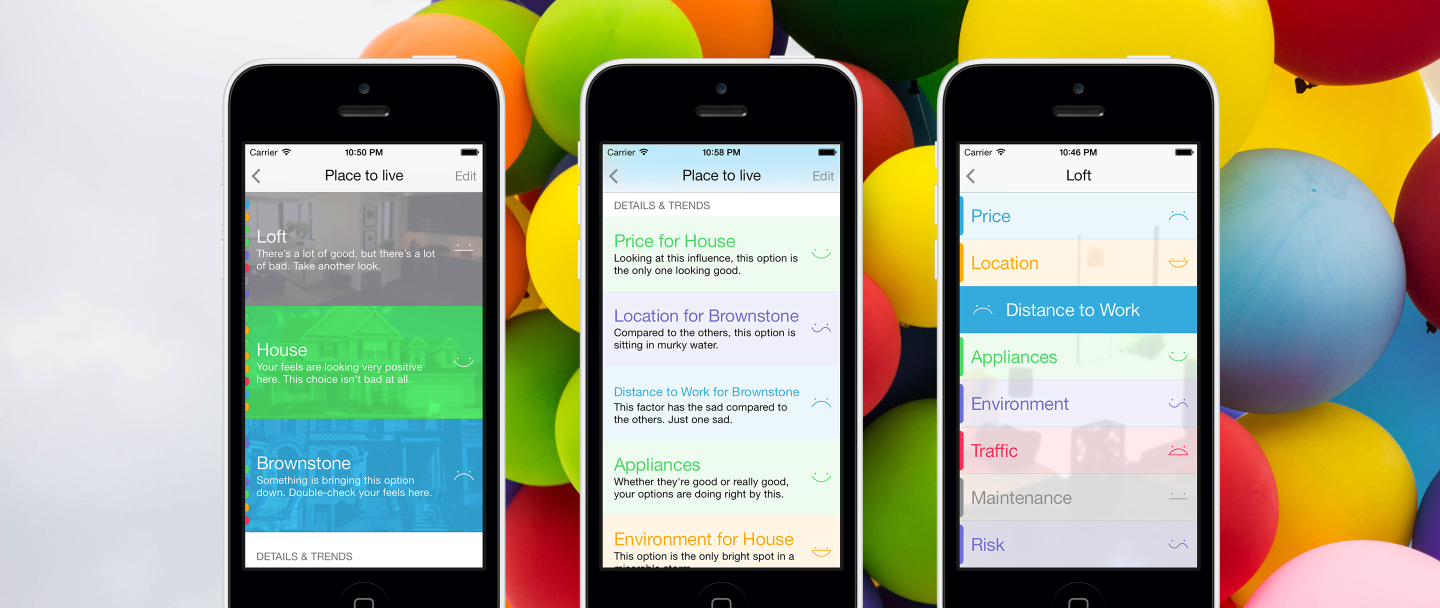
From left: A decision, showing all choices; trends, here showing choices that scored much higher or lower than the others for certain influences; and scores for a single choice.
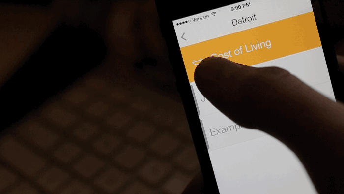
The original emotion-picking interaction.
Result & postmortem
We submitted 1.0 just in time, but followed it up quickly with 1.1 after noticing several show-stopping bugs. 1.1 debuted to the world on Black Friday, November 29, 2013, a week after I graduated. 1.2, with more bug fixes and visual improvements, shipped in early December.
By early January, we had a banner feature by Apple under the Productivity category in the United States. In the first two months we sold nearly 6,000 units.
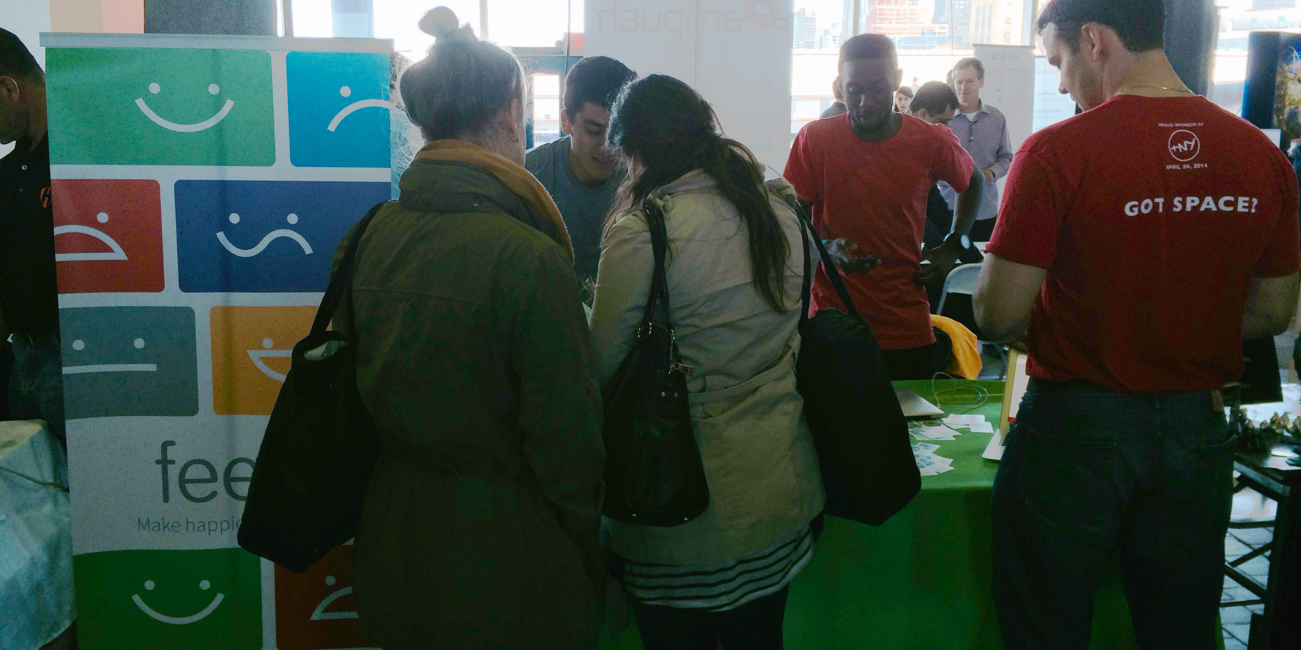
Joseph and Ameer exhibiting the app at NY TechDay in April 2014.
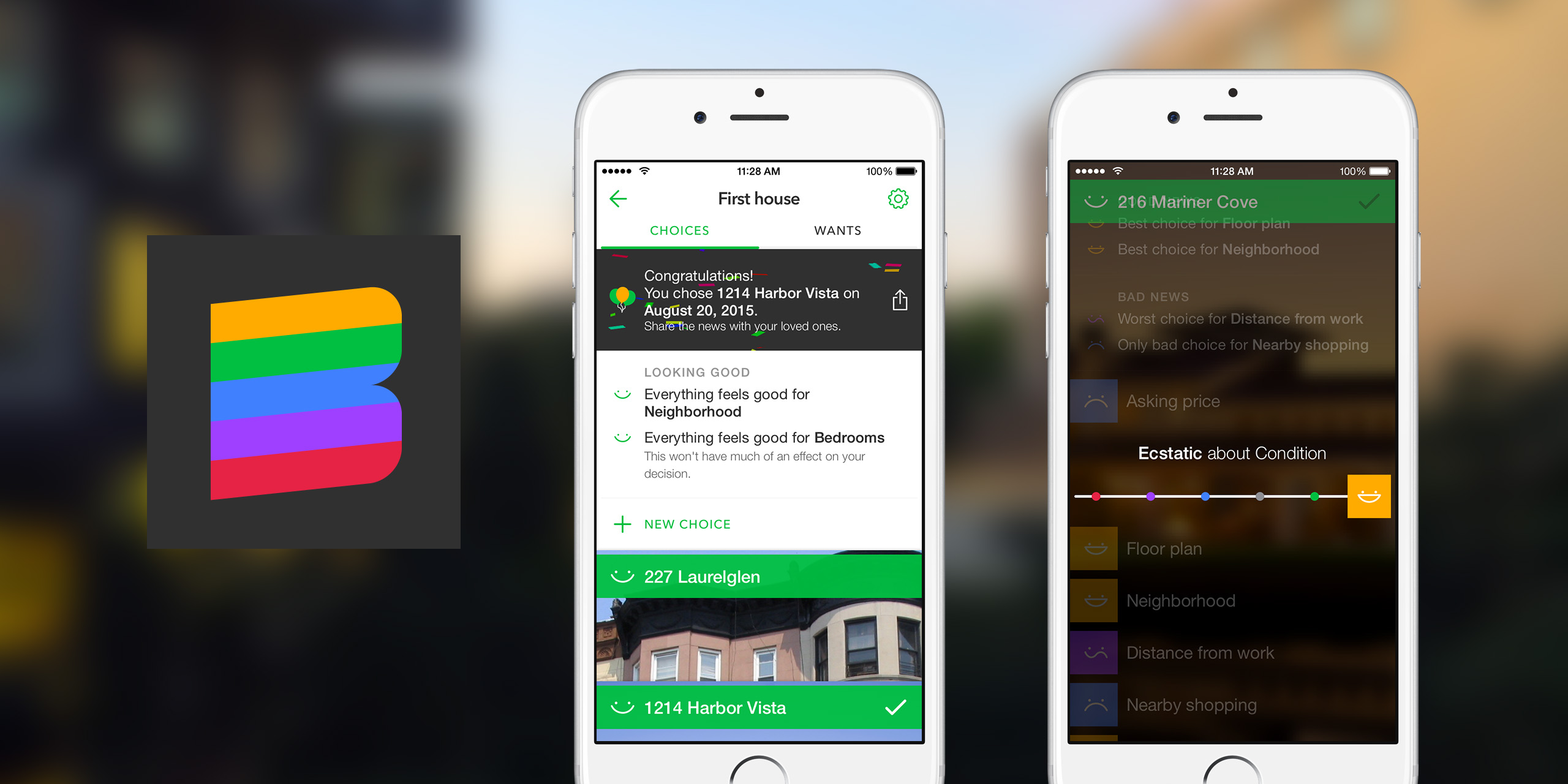
Boldened 1.0 released in August 2015; more than a new name, it was rewritten and featured a new UI with emphasis on the photos added for choices, and exposing more data trends. 2.0 was to follow later in 2015 or early 2016, with another overhaul looking forward to collaborative decisions, but I abandoned the project for other opportunities.
An early preview of the new emotion selection in Feels 2/Boldened 1, taken as a screen capture from the app running on device. Many lessons were learned from our user tests of the original selector, namely that we gave no affordances indicating a slider. This version would struggle with that as well.
Creating this app was an incredible formative experience for me: I had put together a team, found a vision with them, directed them toward that vision, released our idea to the world, and found validation. Overcoming some of my deepest insecurities and accomplishing so much I had struggled to before was nothing short of exhilarating.
Once the initial market attention wore off and life threw the three of us in separate ways, resuming the project in 2015 was more of an uphill climb than I believed it would be. Nonetheless, Boldened established my drive to focus on projects with tangible impact on more than just a privileged tech elite.
Boldened 2, all but complete and collecting digital dust somewhere, looks like this. As before, this is a screen capture of the app running on device.